
>> torsdag den 17. september 2009 –
interior
Home sweet Krabbesholm color

I attendet a Folk high school called Krabbesholm Højskole some years back now. It was a great experience and my younger sister Billa Jenny is now planning to do the same and enroll. As a scandinavian I heart everything white. When growing up I was not allowed to sponge paint my room like all my other friends. I love colors but when I´m exposed to too much color...well I´m not used to it.

Kristjan had a burgundy colored room when we started dating, the color made me depressed and I hated the feel and the atmosphere that came with the burgundy color. What I´m trying to say is that different colors have different influence on us. During my stay at Krabbesholm I actually stayed at one of these dorms. I wonder what it would be like living in such a colorful space...

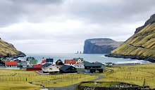
Home Sweet Colours was carried out in collaboration with the working collective Nervous in the Service in the fall of 2006. The project is an interior design of 6 student dorms and the connecting hallway at Krabbesholm Højskole. Home Sweet Colours investigates the idea of how we use a private space and what happens to a room, when you live within the range of only one colour family. The result of the project is a multi-facetted monochromy, and the otherwise similar rooms have each gained their own identity by this systematic mode of colour scales.
Hvor sjovt, jeg har også gået på Krabbesholm! Tilbage i 2001, så det er noget tid siden nu. - Og før de begyndte at male værelserne i sådanne vilde farver...
Det grå værelse ligner SÅ meget det jeg boede på - altså bortset fra farven. :)